Oops, there's too much nitrous oxide
5. Mexican wheat, geoengineering, and ground-truthing the IPCC
Note: The views expressed here are the author’s own and do not reflect the views of Azolla Ventures or Prime Coalition.
Climate surprises
Last time, I shared a theory about climate surprises and pledged to test it. The theory went like this:
Climate scientists are some of the most rigorous people out there. Your favorite scientist’s favorite scientist. They study complex nonlinear systems spanning several disciplines, and, amazingly, they’ve correctly predicted for decades that climate change is coming.
However, climate models can only model what’s known, and climate change is influenced by factors that are both unknown and unknowable today. We’ve already had surprises like widespread methane leaks. There will probably be others. Because of this, current climate models likely understate climate dangers in a systematic way.
Social and political pressures have not been helpful: politicization of science, threats to research funding, climate science generally being a bummer, and so on. Because of this, perhaps some climate scientists and communicators start self-censoring in subtle ways. This might mean toning down conclusions, choosing not to study certain topics, stating catastrophic findings in less alarming ways, you get the picture. Because of this, we systematically understate the climate dangers we do know about.
The combination of these two types of understatement probably mean that we’re in for some nasty climate surprises.
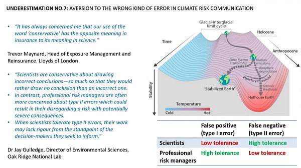
Recently I came across another version of this theory that I like as well: Scientists are conservative in the opposite ways of professional risk managers.

So let’s put it to the test. Any climate surprises lately?
Here’s one: Mexican farms are emitting much more nitrous oxide than we thought.
Emerging scientific evidence suggests that Mexico’s emissions of nitrous oxide are significantly underestimated — emissions may be double or even quadruple what the country reports. It’s a problem that the Mexican government acknowledged to The Washington Post for this story.
As a contributor to climate change, nitrous oxide remains a mysterious villain, crudely measured and less-studied than carbon dioxide and other greenhouse gases. But it has caused 6.5 percent of the world’s current warming, and its concentration in the atmosphere is growing at an accelerating rate, surpassing even some of the worst projections. The gas is 265 times more powerful than carbon dioxide in heating the atmosphere over a period of 100 years. It depletes the planet’s ozone layer. And it lingers in the air for more than a century.
Last year, atmospheric concentrations of nitrous oxide showed a record-high increase, according to the National Oceanic and Atmospheric Administration.
This is an interesting and deeply reported article that I’d encourage you to check out. Along the way, it mentions that the midwest US has a similar story with excess nitrous oxide.1 But why were we surprised by this? And how surprised were we by this?
On the former, I count four reasons:
We don’t measure ground-level nitrous oxide emissions very well.
Farmers in the area reported on in this story use much more fertilizer than is allowed in other countries. Even a Mexican government spokesperson acknowledged that they couldn’t enforce fertilizer regulations if they tried.
Farmers in this area also apply fertilizer before planting crops, which happens to be a good way to create lots of nitrous oxide emissions.2
The IPCC’s model, which estimates that one percent of nitrogen fertilizer becomes nitrous oxide, turned out to be an underestimate when farmers overuse it.
This seems to fall squarely under part two of the original theory – climate change is influenced by factors that are both unknown and unknowable, so as we learn more about it we’re likely to find more emissions. It’s interesting though: on the one hand it’s bad that there were these hidden nitrous oxide emissions, but on the other hand, we already sort of knew they were there. Atmospheric forensics predicted several times more nitrous oxide emissions from Mexico than the country was reporting:
In this light, you could argue that this just fills a gap in our knowledge and isn’t actually anything bad and new. That being said, I still think that “nitrous oxide emissions are 2-4x what we thought in a country that can’t regulate them” qualifies as a nasty climate surprise.
Anyway, I can’t help thinking that there are opportunities tucked away here. For example, the climate tech community has gotten increasingly interested in measuring soil carbon flux as a way of quantifying and eventually compensating carbon stored in soils. Two startups doing this are Yard Stick and Haystack Ag. Why not develop similar tools to cheaply quantify nitrous oxide emissions in a more granular way? Or perhaps develop a device that captures or destroys nitrous oxide at the source? Maybe even rewire soil microbes to emit less nitrous oxide? If you’re working on any of these, we should chat.
Learning curves
Let’s say you’ve invented a new widget and you’d like to build a business around it. Who would you sell your widgets to first? The classic startup answer is something like, “to whoever is willing to pay the most.” You want to find a highly motivated base of customers who really need your widget and will pay a lot for it. Even if that highly motivated customer base is small, your new widget will command high gross margins, which will help you build your business. You could imagine plowing some of that money into R&D to drive down the cost of your widget and enable you to sell your widgets into ever larger and more price-sensitive markets.
Lithium-ion batteries followed this pattern, first showing up in consumer electronic devices, where the battery was a small piece of the overall cost and you could “hide” it among other expensive components. People wanted the device and didn’t care so much that it contained a small expensive battery. That allowed early lithium-ion manufacturers to continue funding R&D and making batteries cheaper. In 2006, Elon Musk told us about Tesla’s plan to do the same thing with EVs powered by lithium-ion batteries, and then they basically did it:
Build sports car
Use that money to build an affordable car
Use that money to build an even more affordable car
While doing above, also provide zero emission electric power generation options
Sometimes it’s easy to figure out your “sports car” market; sometimes it’s hard. So generations of startups have spent countless hours figuring this stuff out, in an exercise broadly called “customer discovery.”
Now, let’s say your widget isn’t a battery, but rather a technology that allows you to manipulate cloud cover and influence weather patterns without nasty side effects. Your big goal might be something like “alleviation of the worst effects of global warming,” but nobody would trust you with a deployment that large right away. Also, you probably wouldn’t have the money to pull it off. So how would you get there? You’d do some customer discovery.
Is customer discovery going to be easy or hard for weather manipulation? Well first, you’d probably narrow your search to sovereign governments, but then all you have to do is some googling to find out how badly at least one potential customer wants your technology:
China is planning a rapid expansion of its weather modification programme to cover an area more than one and a half times the size of India, in a move likely to raise concerns among the country’s neighbours.
The decision, announced by the cabinet on Wednesday night, would increase fivefold the world’s biggest cloud-seeding operation, which already employs an estimated 35,000 people.
For six decades, the communist nation has deployed military aircraft and anti-aircraft guns to lace clouds with silver iodide or liquid nitrogen to thicken water droplets to the point where they fall as snow or rain. The technology has mostly been used at a local level to alleviate droughts or clear skies ahead of major events, such as the 2008 Olympics or last October’s 70th anniversary of the People’s Republic of China.
China really wanted the weather to behave ahead of some major events, so they took the quick and dirty route. You can start to see the sports car analogy here: modifying the weather for special events is a luxury; if there were a technology that could accomplish the same goal in a cheaper, safer, and cleaner way, it could be quite impactful and valuable to governments.
Having scanned this field for a little while, here are a few other apparent early uses of weather modification technology:
As I’ve said before, I’m fairly confident that in time, humanity will end up doing lots of solar radiation management to combat climate change. The carbon math isn’t in our favor, and manipulating the weather is too potentially cheap and effective not to consider. As with any other new technology, it’ll need to come down a learning curve. For reasons of cost, risk, and fairness, that’s a good thing. The stakes are too high to screw it up.
The IPCC adaptation report – part I
A few weeks ago, the Intergovernmental Panel on Climate Change (IPCC) released a report called Climate Change 2022: Impacts, Adaptation, and Vulnerability. Like most IPCC reports, it’s huge. I count:
3,675 pages
18 chapters
10 fact sheets
Seven cross-chapter papers
Two annexes
One FAQ, technical summary, and summary for policymakers.
But my point of this post isn’t that the report is huge. My point is to raise the question: what do you do with all this material?
If you saw anything about this report at all, you probably saw something like this:

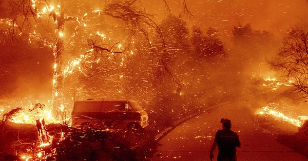
As grim as that photo is, the article itself is still more heart-wrenching: displaced families, flooded fields, a dead giraffe. In the introductory post to this whole project, I wrote, “There are many more talented writers covering the doom and gloom of climate change,” and they sure did prove me right.
I’m of two minds here. On the one hand, the IPCC’s reports deserve attention. The scientific community is reporting and projecting some awful stuff. The authors are insanely talented and credentialed, and every statement is backed by academic research. The fact that there’s an international body funding and publishing this work is a reflection of the best of humanity. The IPCC has even done the excruciating work of condensing 3,675 pages into a 36-page Summary for Policymakers (which we’ll call the “SPM” from here on out).
But on the other hand, it’s an understatement to say that the average person just isn’t gonna crack open one of these PDFs. I also can’t shake the feeling that this high-level, hell-on-earth style of coverage isn’t helping. It feels like preaching to the choir while turning off otherwise well-intentioned people, and it makes it harder for people to learn about what’s actually in the report. So today, I’ve cracked open the PDFs for you.
How does the IPCC know what it knows?
Instead of trying to encapsulate decades of work into a few sentences, we’ll take the opposite approach. Let’s get to the bottom of one single claim. How does the IPCC know what it knows?
Let’s dive in.
Here’s a paragraph chosen more or less at random. Here’s a link to the PDF, in case you’d like to follow along. We’ll start with the full paragraph and work our way down to one specific claim, which I’ve bolded here:
SPM.C.3.1 Soft limits to some human adaptation have been reached, but can be overcome by addressing a range of constraints, which primarily consist of financial, governance, institutional and policy constraints (high confidence). For example, individuals and households in low lying coastal areas in Australasia and Small Islands and smallholder farmers in Central and South America, Africa, Europe and Asia have reached soft limits (medium confidence). Inequity and poverty also constrain adaptation, leading to soft limits and resulting in disproportionate exposure and impacts for most vulnerable groups (high confidence). Lack of climate literacy at all levels and limited availability of information and data pose further constraints to adaptation planning and implementation (medium confidence). {1.4, 4.7, 5.4, Table 8.6, 8.4, 9.1, 9.4, 9.5, 9.8, 11.7, 12.5 13.5, 15.3, 15.5, 15.6, 16.4, Figure 16.8, 16.4, Box 16.1, CCP5.2, CCP5.4, CCP6.3}
First, there are some IPCC conventions to untangle. Let’s start there:
“SPM.C.3.1”
This is an indexing convention:
SPM stands for “Summary for Policymakers,” the document in which this paragraph appears.
C refers to section C of the SPM document, titled “Adaptation Measures and Enabling Conditions.”
3 refers to sub-section 3 of section C, titled “Limits to Adaptation.”
1 refers to paragraph 1 of sub-section 3, which pertains to “soft” limits to adaptation3 and how we might overcome them. The first sentence in paragraph SPM.C.3.1 is the same as the first sentence in the overview paragraph for sub-section SPM.C.3; the rest of paragraph SPM.C.3.1 provides evidence to support the claim.
So, “SPM.C.3.1” means Summary for Policymakers document, section C, sub-section 3, paragraph 1, which discusses soft limits to adaptation.
Is this indexing convention confusing? Sure. Would it be nice if the IPCC recognized that this document isn’t gonna be a linear, front-to-back read for most people and gave readers a little heads-up about what all the codes mean? Sure. But hey, it’s not my report. Most of the authors are academics, so it’s not surprising they’ve numbered sections like you might in a dissertation. Maybe the barrier to entry adds an air of credibility.
“Medium confidence”
In the introduction to the (SPM.A), it says:
Based on scientific understanding, key findings can be formulated as statements of fact or associated with an assessed level of confidence using the IPCC calibrated language4.
How did the IPCC calibrate this language? Let’s go to footnote 4:
Each finding is grounded in an evaluation of underlying evidence and agreement. A level of confidence is expressed using five qualifiers: very low, low, medium, high and very high, and typeset in italics, e.g., medium confidence. The following terms have been used to indicate the assessed likelihood of an outcome or a result: virtually certain 99-100% probability, very likely 90-100%, likely 66-100%, as likely as not 33-66%, unlikely 0-33%, very unlikely 0-10%, exceptionally unlikely 0-1%. Assessed likelihood is typeset in italics, e.g., very likely. This is consistent with AR5 and the other AR6 Reports.
Okay, so while statements of likelihood are linked to quantitative values, statements of confidence seem to be defined self-referentially. I was hoping for more here. If anyone knows something different, drop me a line!
The stuff in the curly brackets
At the end of paragraph SPM.C.3.1, there’s a bunch of stuff in curly brackets. Here it is again:
{1.4, 4.7, 5.4, Table 8.6, 8.4, 9.1, 9.4, 9.5, 9.8, 11.7, 12.5 13.5, 15.3, 15.5, 15.6, 16.4, Figure 16.8, 16.4, Box 16.1, CCP5.2, CCP5.4, CCP6.3}
Here’s what the report says about it (again, back in SPM.A):
The scientific evidence for each key finding is found in the 18 chapters of the underlying report and in the 7 cross-chapter papers as well as the integrated synthesis presented in the Technical Summary (hereafter TS) and referred to in curly brackets {}.
The long list of numbers refers to chapters and sections of the full IPCC report that speak to the claims in the paragraph. For example, “9.5” refers to Chapter 9 (Africa), Section 5 (Observed and Projected Climate Change). If you go to section 9.5, you’ll find a long list of observations, projections, and figures describing the effects of climate change in Africa. These are organized by region, types of weather events, and environmental features.
That’s all well and good, but this curly bracket convention makes it tough to link specific statements in paragraph SPM.C.3.1 to specific statements in the chapters. If you wanted to map a claim in the paragraph to a specific passage in the rest of the report, you’d have to look in 23 different places, many of which might have several pages of content to sift through. It feels more like a data dump than a clean list of citations, and it has a muddying effect when you’re trying to map out how they know what they know. It’s not practical , and functionally, it’s another barrier to entry: either you need to spend hours tracking back links, or you just have to trust that the authors know what they’re talking about and have linked to everything correctly. Given the number of citations I screwed up when I was writing papers in grad school (not zero), it also makes me worry about human error.
I’m now editorializing where I’m supposed to be explaining, but: we have the tools to avoid this! In parallel to the PDFs, it’s possible to publish a version where you can hover over each claim and trace it back to the sections in the full report that support the claim. The IPCC has already done the painstaking work of mapping claims to specific pieces of evidence, and academic journals already have some tools that do this. Why not carry that data through to the final version?
And finally, the text itself
It’s been a while, so here’s our target sentence from SPM.C.3.1 again:
For example, individuals and households in low lying coastal areas in Australasia and Small Islands and smallholder farmers in Central and South America, Africa, Europe and Asia have reached soft limits (medium confidence).
Even this sentence is pretty dense. The claim is that some groups have reached soft limits to adaptation, but it’s applied across seven groups by my count: individuals and households in low lying coastal areas in Australasia and Small Islands (2), and smallholder farmers in Central and South America, Africa, Europe and Asia (5). This is still too much to chase down, so let’s go really small and look at just one part: what evidence is there that smallholder farmers in sub-Saharan Africa have reached soft limits of adaptation?
For reasons discussed in the last section, it was a heavy lift to chase down this claim. Chapter 9 alone is 225 pages. So I dug around sections 9.1, 9.4, 9.5, and 9.8 until I came back with something from section 9.8.2.1 that looked relevant. Here it is (reformatted for clarity):
Climate change is already negatively impacting crop production and slowing productivity growth in Africa (high confidence) (Iizumi et al., 2018; Ray et al., 2019; Sultan et al., 2019; Ortiz-Bobea et al., 2021).
Climate change has reduced total agricultural productivity growth in Africa by 34% since 1961, more than in any other region (Ortiz-Bobea et al., 2021), more than in any other region.
Maize yields have decreased 5.8% and wheat yields 2.3%, on average, in sub-Saharan Africa due to climate change in the period 1974–2008 (Ray et al., 2019).
Overall, climate change has decreased food total calories across all crops in sub-Saharan Africa by 1.4% on average compared to a no climate change counterfactual since 1970, with up to 10% reductions in Ghana and Zimbabwe (Ray et al., 2019).
Even this is a lot, so let’s get narrower still and look for the source of just the claim that maize yields have decreased 5.8%. This takes us to Ray et al., 2019, which is an article in PLoS One titled, “Climate change has likely already affected global food production.” Luckily, it’s a freely available PDF,4 so here’s the table with the goods (circled in red):
Okay, great, maybe a little anticlimactic, but there’s the number. But we’re looking for GROUND truth – how’d they come up with it? Well, if you scroll down to the Methods section, you’ll see that they took a climate dataset corresponding to 0.5 ºC warming, mapped it to a known crop yield dataset, and then modeled how much of the observed changes in crop yield were caused by climate change. They did this last part with an equation:
Here’s where our analysis ends. We’re not gonna get into that equation. Suffice it to say that some of the variables correspond to changes in temperature and precipitation due to climate change. We’ll have to take the authors’ word. As is so often the case in today’s world, “ground truth” lies deep in some Excel sheet, and we just have to trust that the owners of the sheet know what they’re doing.
Takeaways
So, how does the IPCC know what it knows? When it comes to maize production in sub-Saharan Africa from 1974-2018, researchers have shown that maize production has fallen, and there’s a complex model that says how much of that decrease can be attributed to climate change.
When it comes to assessing “soft limits to adaptation,” however, I have no idea how the IPCC knows what it knows. That’s a bit disappointing.
And when it comes to the process of finding this information, I have some hot takes:
The IPCC has its own language and codes, even in its Summary for Policymakers. Perhaps it’s necessary given how information-dense this stuff is, but functionally this is a a barrier to entry.
Chasing down ground truth on one claim of one sentence is like navigating a complex web. I get it, research is messy, but it feels like there’s more that the IPCC could do to point back to ground truth.
Information is lost as you move between layers. For example, references ascribed to statements in the SPM are cited in groups, making it challenging to disentangle which claims link to which sections in which chapters. To get to the bottom of just smallholder farms in sub-Saharan Africa, it wasn’t clear whether I should have read sections 9.1, 9.4, 9.5, 9.8, or any of the other 18 sections cited.
Even if you do figure out exactly which section to read, the individual sections in chapters are long! Tracking down a statement attributed to Section 9.5 required a lot of work.
Overall, it was hard to find out how the IPCC knows what it knows, and I still came back only halfway satisfied. A lot of this friction seems avoidable. Is it time for the IPCC to push past the PDF?
Stay tuned for part II, where we’ll get into the IPCC’s proposed adaptation solutions.
Elsewhere
Thanks for reading!
Please share your thoughts and let me know where I mess up! You can reply directly, leave a comment, or find me below:
I also feel obligated to remind you that nitrous oxide is a recurring plot point in the Fast and the Furious franchise.
In short: soil microbes metabolize nitrogen fertilizer into a range of compounds, some of which is nitrous oxide.
Soft limits are those where adaptation options are currently not available but may become available in the future, while hard limits are those where no further adaptation is possible.
Don’t get me started on academic journal paywalls.


