
Flatten the curve
25. Temperature-related mortality is a choice

Note: The views expressed here are the author’s own and do not reflect the views of Energy Impact Partners.
Extreme temperatures are not good for people. Negative health outcomes like excess deaths go up when temperatures are too hot or too cold. It turns out that researchers have been measuring this for a while, and have even gone so far as to plot curves of mortality risk versus temperature. Hannah Ritchie published a few pieces on this last year, showing a model curve:
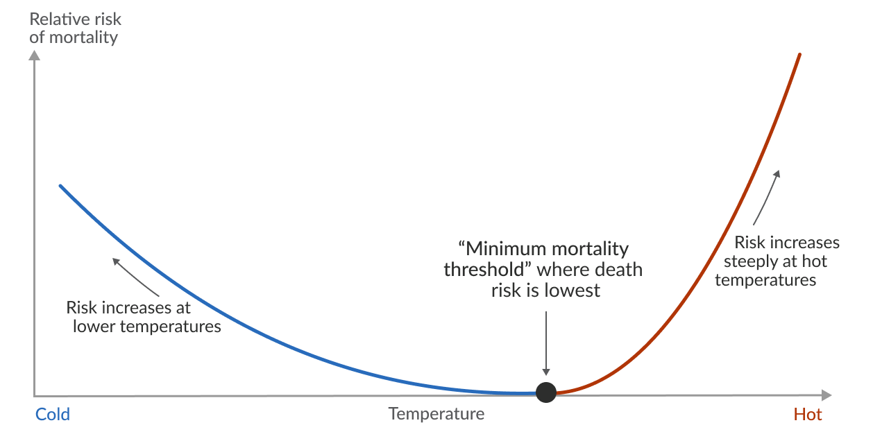
As you can see, there is an “optimal” temperature where mortality risk is lowest. Below that temperature, risk goes up modestly; above that temperature risk goes up sharply.
The shape of this curve is basically the product of two things: the weather we have, and how we choose to cope with it. We can only do so much about weather (for now?), but we can control how we cope with it. Want to flatten the left side of the curve? Heat buildings when it’s cold and provide access to shelter for those who don’t have it. Want to flatten the right side of the curve? Do the same with air conditioning. It’s not rocket science, it’s the result of policy choices. Provide abundant energy, HVAC upgrades, and a social safety net, and mortality goes down.

Consider the following: in 2021, the Pacific Northwest went through a “heat dome” that lasted several weeks. Vancouver saw high temperatures of 90 ºF, which is only about 15 ºF higher than typical. But because Vancouver’s climate is usually moderate, only 26% of people had air conditioning. This made 90 ºF a catastrophic event: 619 people died from heat-related causes! Elsewhere in the region, infrastructure that hadn’t been built to withstand heat suffered damage. In all, the event led to an estimated 1,400 deaths and $9b in damage.
Meanwhile, Austin had 94 days above 90 ºF in 2021 and it was a non-event. 99% of Texan households have air conditioning, the infrastructure is designed withstand the heat, and the grid usually has enough capacity to handle the load. Austin isn’t alone. Las Vegas had 140 days above 90 ºF and 87 days above 100 ºF; Phoenix had 143 days above 90 ºF and 50 days above 100 ºF.
These differences are significant enough to show up in mortality risk curves!
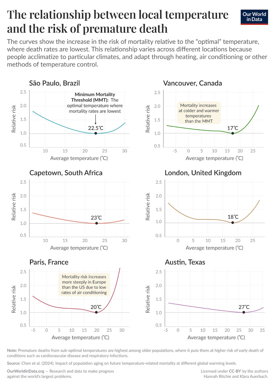
In extreme climates, cities take extremes more seriously, so they build infrastructure to withstand those scenarios. A few degrees in either direction won’t cause too much of an issue. In mild climates they generally don’t, so abnormal events can get gnarly quickly. In a weird way, if you’re concerned about surviving in a changing climate, it’s actually safer to live somewhere extreme.1
I’m sort of joking, that’s not completely true. It’s obviously worse to live in Texas if you’re one of the 1% who doesn’t have air conditioning. If you’re worried about drowning, don’t live on a boat. And yet, look at the curves!
I think this shows an optimistic picture. We plainly have a bunch of the tools we need to weather a changing climate. We invented them a century-plus ago. But it requires a little planning. We should be overbuilding energy infrastructure, designing buildings for wider temperature ranges, and hardening both. These are our lifelines, and we know that the future will be more turbulent.
Of course, doing this is more expensive than doing nothing. Governments will probably need to set standards, and customers will probably need to demand more from the companies that serve them. Innovations like EIP portfolio company Transaera’s dehumidification technology can reduce associated energy needs.
Stepping back: some parts of climate change are unpredictable. This is not one of them! We know what’s coming and how live with it. Do we want Vancouver, Paris, or London to be livable in 50 years? Be more like Austin. Flatten the curve.

Elsewhere:
Thanks for reading!
Please share your thoughts and let me know where I mess up. You can find me on LinkedIn and X.
You might also notice that the y-axes on these curves are relative risk rather than absolute risk. If you (I think safely) assume that weather-related mortality is close to zero at a city’s temperature of minimum risk, then it’s reasonable to treat these curves as roughly direct comparisons.